


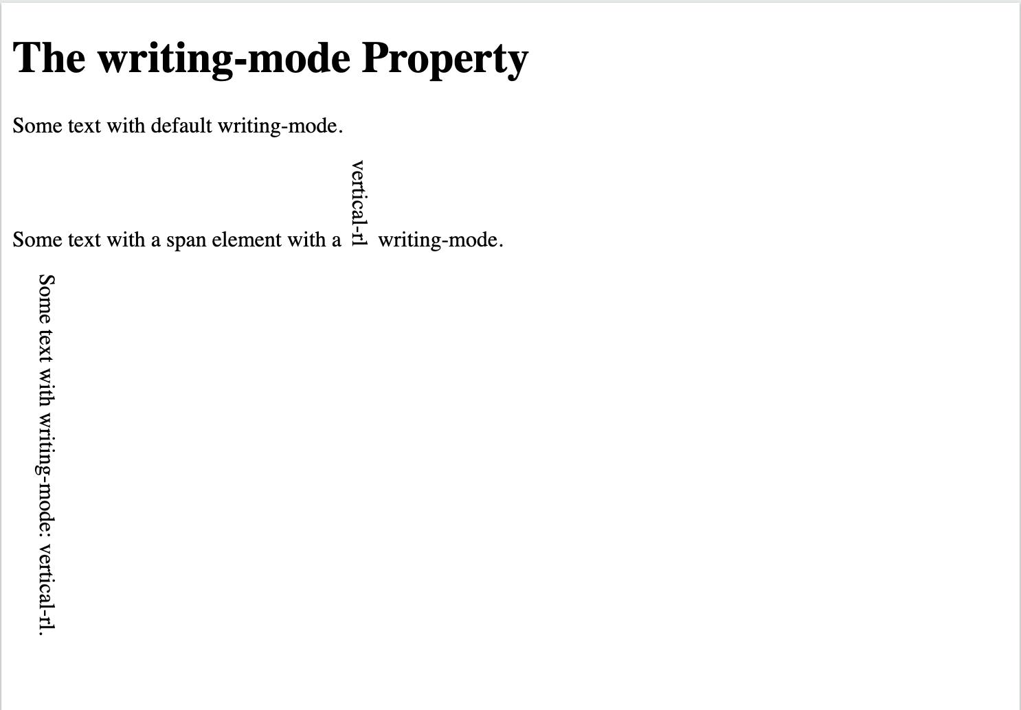
Writing Mode: The
writing-modeproperty specifies whether lines of text are laid out horizontally or vertically.CSS: writing-mode: horizontal-tb;
To understand better refer to this writing-mode
CODE-
 <html>
 <head>
 <style>
 p.test1 {
   writing-mode: horizontal-tb;
 }

 p.test2 {
   writing-mode: vertical-rl;
 }

 span.test2 {
   writing-mode: vertical-rl;
 }
 </style>
 </head>
 <body>

 <h1>The writing-mode Property</h1>

 <p class="test1">Some text with default writing-mode.</p>

 <p>Some text with a span element with a <span class="test2">vertical-rl</span> writing-mode.</p>

 <p class="test2">Some text with writing-mode: vertical-rl.</p>

 </body>
 </html>
2. GAP: The gap property defines the size of the gap between the rows and between the columns in a flexbox, grid or multi-column layout.
CSS: gap: 20px 50px;
To understand better refer to this gap.
CODE -
<!DOCTYPE html>
<html>
<head>
<style>
#grid-container {
  border: 1px solid black;
  background-color: mintcream;
  display: grid;
  grid-template-columns: auto auto auto;
  gap: 20px 50px;
}

#grid-container > div {
  border: 1px solid black;
  background-color: yellow;
}
</style>
</head>
<body>

<h1>The gap Property with grid</h1>

<p>Use the <em>gap</em> property to specify the size of the gap between the rows and the columns.</p>
<p>This grid has a 20px gap between the rows, and a 50px gap between the columns:</p>

<div id="grid-container">
  <div>1</div>
  <div>2</div>
  <div>3</div>
  <div>4</div>
  <div>5</div>
  <div>6</div>
  <div>7</div>
  <div>8</div>
</div>

</body>
</html>

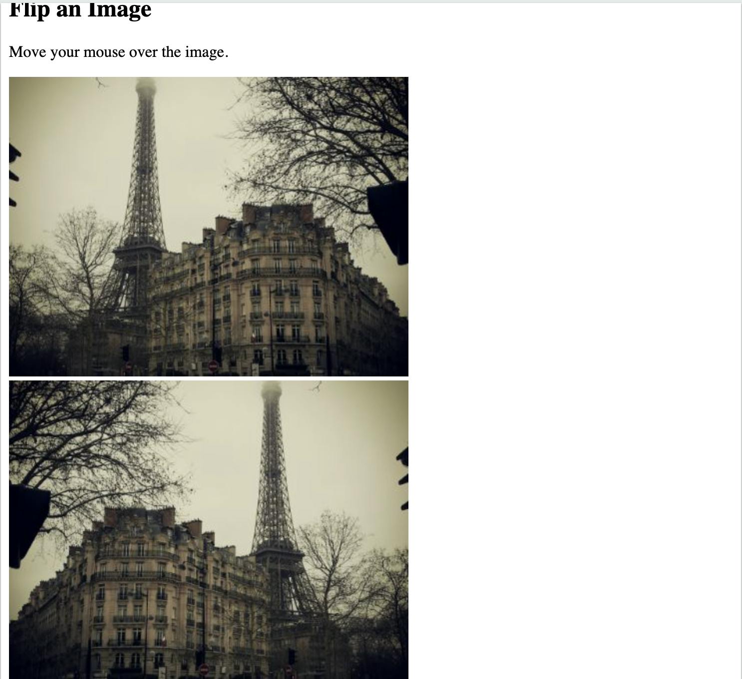
- Flip an Image: This property/hack will help you flip the image.
CSS: transform: scaleX(-1);
To understand better refer to this flip image.
CODE -
<!DOCTYPE html>
<html>
<head>
<meta name="viewport" content="width=device-width, initial-scale=1">
<style>
img:hover {
  -webkit-transform: scaleX(-1);
  transform: scaleX(-1);
}
</style>
</head>
<body>

<h2>Flip an Image</h2>
<p>Move your mouse over the image.</p>

<img src="img_paris.jpg" alt="Paris" width="400" height="300">

</body>
</html>
- Smooth Scrolling: The
scroll-behaviorproperty specifies whether to smoothly animate the scroll position, instead of a straight jump, when the user clicks on a link within a scrollable box.
CSS: scroll-behavior: smooth;
To understand better refer to this smooth scroll.
CODE -
<!DOCTYPE html>
<html>
<head>
<style>
html {
  scroll-behavior: smooth;
}

#section1 {
  height: 600px;
  background-color: pink;
}

#section2 {
  height: 600px;
  background-color: yellow;
}
</style>
</head>
<body>

<h1>Smooth Scroll</h1>

<div class="main" id="section1">
  <h2>Section 1</h2>
  <p>Click on the link to see the "smooth" scrolling effect.</p>
  <a href="#section2">Click Me to Smooth Scroll to Section 2 Below</a>
  <p>Note: Remove the scroll-behavior property to remove smooth scrolling.</p>
</div>

<div class="main" id="section2">
  <h2>Section 2</h2>
  <a href="#section1">Click Me to Smooth Scroll to Section 1 Above</a>
</div>

<p><strong>Note:</strong> The scroll-behavior property is not supported in Internet Explorer.</p>

</body>
</html>Scroll Snapping: The scroll-snap-type specifies how the elements will snap into focus when you stop scrolling, and in what direction.
Scroll snapping: To acheive scroll snap behaviour, the
scroll-snap-typeproperty must be set on the parent element, and thescroll-snap-alignproperty must be set on the child elements.CSS : scroll-snap-type: x mandatory and scroll-snap-align: center
To understand better refer to this scroll snapping.
CODE -
 <!DOCTYPE html>
 <html>
 <head>
 <style>
 * {
     box-sizing: border-box;
     margin: 0;
     padding: 0;
 }
 body {
     overflow-y: hidden;
 }
 .slider {
     font-family: sans-serif;
     scroll-snap-type: x mandatory;
     display: flex;
     -webkit-overflow-scrolling: touch;
     overflow-x: scroll;
 }
 section {
     border-right: 1px solid white;
     padding: 1rem;
     min-width: 100vw;
     height: 100vh;
     scroll-snap-align: start;
     text-align: center;
     position: relative;
 }
 h1    {
     position: absolute;
     top: 50%;
     transform: translateY(-50%);
     text-align: center;
     color: white;
     width: 100%;
     left: 0;
     font-size: calc(1rem + 3vw);
 }
 </style>
 </head>
 <body>
 <div class="slider">
     <section>
         <h1>Section One</h1>
     </section>
     <section>
         <h1>Section Two</h1>
     </section>
     <section>
         <h1>Section Three</h1>
     </section>
     <section>
         <h1>Section Four</h1>
     </section>
     <section>
         <h1>Section Five</h1>
     </section>
 </div>
 </body>
 </html>
Resize everything: The
resizeproperty defines if (and how) an element is resizable by the user.
NOTE: Theresizeproperty does not apply to inline elements or to block elements where overflow="visible". So, make sure that overflow is set to "scroll", "auto", or "hidden".CSS: resize: both
To understand better refer to this resize.
CODE-
 <!DOCTYPE html>
 <html>
 <head>
 <style>
 div {
   border: 2px solid;
   padding: 20px;
   width: 300px;
   resize: both;
   overflow: auto;
 }
 </style>
 </head>
 <body>

 <h1>The resize Property</h1>

 <div>
   <p>Let the user resize both the height and the width of this div element.</p>
   <p>To resize: Click and drag the bottom right corner of this div element.</p>
 </div>

 </body>
 </html>

- Clip Text(text-overflow): The
text-overflowproperty specifies how overflowed content that is not displayed should be signaled to the user. It can be clipped, display an ellipsis (...), or display a custom string.
CSS: text-overflow: ellipsis
NOTE: Both of the following properties are required: white-space: nowrap; overflow: hidden;
To understand better refer to this text-overflow.
CODE -
<!DOCTYPE html>
<html>
<head>
<style>
h1 {
  width: 200px;
  white-space: nowrap;
  overflow: hidden;
  text-overflow: ellipsis;

  padding: 20px;
  font-size: 1.3rem;
  margin: 0;
  background: white;
  resize: horizontal;
}
h2 {
  width: 200px;
  padding: 20px;
  font-size: 1.3rem;
  margin: 0;
  background: white;
}
body {
  height: 100vh;
  overflow: hidden;
  display: grid;
  place-items: center;
  background: #ccc;
}
</style>
<body>
<h1>
  This little piggy went to market and this little piggy stayed home.
</h1>
<h2>
  This little piggy went to market and this little piggy stayed home.
</h2>
</body>
</html>
- Text Gradient: This is an amazing property to add gradient color to your texts.
NOTE: This is WebKit only, but is the cleanest way to accomplish it as the text remains editable and selectable web text.
CSS : background: -webkit-linear-gradient(#eee, #333); -webkit-background-clip: text; -webkit-text-fill-color: transparent;
To understand better refer to this text-gradient.
CODE -
<!DOCTYPE html>
<html>
<head>
<style>
h1 {
  font-size: 72px;
  background: -webkit-linear-gradient(#eee, #333);
  -webkit-background-clip: text;
  -webkit-text-fill-color: transparent;
}
</style>
<body>
<h1>Example</h1>
</body>
</head>
</html>
Image Reflections: The
box-reflectproperty is used to create an image reflection.The value of the
box-reflectproperty can be:below,above,left, orright.CSS: -webkit-box-reflect: below;
To understand better refer to this box-reflect.
CODE -
<!DOCTYPE html>
<html>
<head>
<style>
img {
  -webkit-box-reflect: below;
}
</style>
</head>
<body>

<h1>CSS Image Reflection</h1>

<p>Show the reflection below the image:</p>
<img src="img_tree.png">

</body>
</html>
- Clip-Path: The
clip-pathproperty lets you clip an element to a basic shape or to an SVG source.
NOTE: The clip-path property will replace the deprecated clip property.
CSS: clip-path: circle(50%);
To understand better refer to this clip-path.
CODE-
<!DOCTYPE html>
<html>
<head>
<style>
img {
  clip-path: ellipse(130px 140px at 10% 20%);
}
</style>
</head>
<body>

<h2>The clip-path property</h2>

<img src="w3css.gif" width="100" height="140">

</body>
</html>

And that's it. Hope you guys got to know some very cool and amazing properties.
Also if you guys know any other such CSS properties do drop them on the comments.